A Symphony of Imperfection: Finding Beauty in Flawed Digital Reproductions
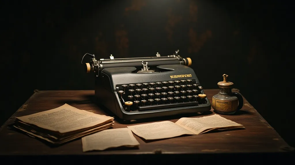
There's a certain romance attached to antique typewriters. It’s more than nostalgia; it’s a visceral connection to a slower, more deliberate era of communication. Each keystroke wasn’t just a letter; it was a small act of creation, imprinted onto the page with a tangible weight and character. The sounds—the clack, the ding, the satisfying thud—were part of the message itself. Today, we strive to recapture that essence digitally, but true reproduction isn’t about perfect mimicry. It's about embracing the symphony of imperfection inherent in those iconic machines, and that's the core philosophy behind our replica typewriter font library.
My own fascination began with my grandfather’s old Underwood. It sat in his study, a silent sentinel of countless letters, poems, and stories. The keys were worn, the ribbon faded, and the occasional letter would smudge or skip, leaving a ghostly trace of a missing character. As a child, I saw these “flaws” as frustrating. But as I grew older, I began to understand that they were the very qualities that imbued the text with its unique personality. They told a story not just of the words themselves, but of the typewriter's journey, its years of faithful service, and the human hands that guided it.

Beyond Replication: Understanding the Analog Spirit
Creating a digital typeface that truly captures the essence of an antique typewriter is a delicate dance. It’s tempting to focus solely on the letterforms—the precise angles, the subtle curves. But that’s only half the battle. A perfect digital replica would be sterile, lifeless, devoid of the charm that makes these typewriters so beloved. The real challenge lies in recreating the *feeling* of typing on these machines—the way the ink spreads, the slight inconsistencies in spacing, the subtle distortions caused by worn parts and imperfect ribbon alignment.
Consider the Smith-Corona Silent. Its reputation for quiet operation masked a crucial detail: the type slugs themselves weren't perfectly aligned. This resulted in a slight, almost imperceptible wobble in the printed characters – a quirk that’s surprisingly difficult to replicate digitally without appearing like a glitch. Or take the Olivetti Lettera 32, a masterclass in Italian design. Its elegant curves and refined details are instantly recognizable, but the ribbon’s tendency to shift slightly on the platen created a subtle horizontal “jitter” that’s essential for capturing its authentic feel. Simply copying the shapes isn't enough; the *behavior* must be replicated, too.
The Art of the Flaw: Intentional Imperfection
Our approach isn’t about erasing the imperfections; it’s about amplifying them, incorporating them into the digital design. We analyze original typewritten samples under magnification, meticulously documenting the nuances of ink spread, the subtle variations in character height and width, and the occasional ink droplet or smudge. These observations inform the creation of digital fonts that aren’t just accurate representations of the letterforms, but also faithfully reproduce the textural and visual characteristics of the original typewritten output.
This process often involves introducing subtle “noise” into the digital font—random variations in character spacing, slight distortions in the letterforms, and the occasional simulated ink blot. These additions might seem counterintuitive, but they are crucial for conveying the tactile and visual richness of the original typewritten experience. It's a philosophical choice: are we aiming for sterile precision, or for the lived-in beauty of an object that’s been shaped by time and use?
More Than Fonts: A Gateway to Understanding
Our digital typewriter font collection is more than just a set of fonts. It's a curated archive of typewriter history, a celebration of craftsmanship, and a gateway to understanding the unique character of these iconic machines. Each font comes with detailed background information on the corresponding typewriter model, including its history, design features, and typical use cases. We also provide insights into the restoration process – a challenging but rewarding endeavor that requires patience, skill, and a deep appreciation for mechanical ingenuity.
Restoring a typewriter is more than just cleaning and lubricating the parts. It’s about understanding how the machine works, identifying and repairing any damage, and preserving its original character. Many restorers deliberately avoid making the typewriter “perfect,” opting instead to retain its patina of age and use. This philosophy aligns perfectly with our approach to font design—the beauty lies not in flawlessness, but in the story that the imperfections tell.
Preserving a Legacy
The rise of digital communication has, in many ways, distanced us from the physicality of writing. The clack of the keys, the smell of the ink, the satisfying thump of the carriage return—these sensory experiences are increasingly rare. By recreating the fonts and sharing the history of these remarkable machines, we hope to keep the spirit of the typewriter alive, to inspire a renewed appreciation for the art of handwriting, and to connect people to a tangible link with the past.
The allure of an antique typewriter isn't just about nostalgia; it's about a different way of working, a slower pace of life, and a deeper connection to the written word. It’s about the beauty that emerges from imperfection, the character that is forged in time, and the stories that are imprinted onto the page. And with each keystroke – digital or otherwise – we can continue to celebrate that legacy.