The Cartographer of Characters: Building Your Digital Typewriter Font Collection
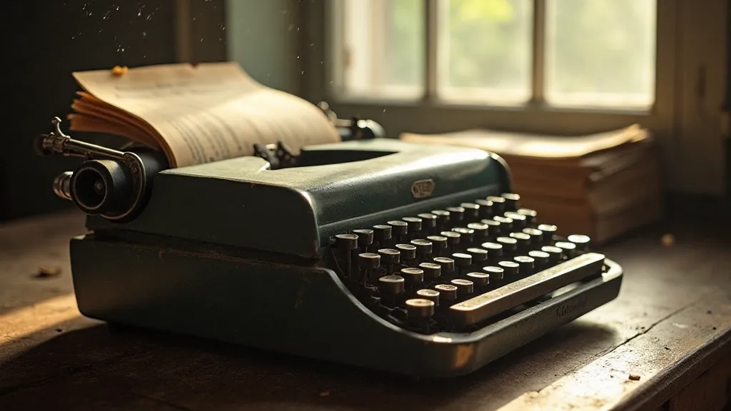
There's a tangible poetry to antique typewriters. Not just the clatter, the mechanical precision, but the inherent limitation – each letter a carefully cast character, a deliberate mark pressed into the page. It speaks of a slower, more considered pace, a world where every word felt earned. As a graphic designer, I’m endlessly fascinated by the unique visual language these machines created, a language I’m dedicated to preserving – not just through restoration, but through meticulous reproduction in the digital realm. Building a collection of digital typewriter fonts isn’t just about finding cool retro looks; it's about becoming a cartographer of characters, charting the specific nuances and history of these mechanical marvels.
The Allure of Imperfection: More Than Just Retro
The popularity of “retro” aesthetics in design is undeniable, but the true appeal of typewriter fonts goes beyond a simple trend. These fonts carry a weight of history, a testament to a time before pixels and kerning algorithms. They're inherently imperfect - the slight misalignments, the subtle variations in letter height, the occasional ink bleed or chipped character – all contribute to a sense of authenticity that digital fonts often struggle to replicate. Trying to *perfect* a typewriter font loses the essence of what makes them so compelling. It's the little flaws, the quirks, that tell the story. Often, these imperfections aren't just random occurrences, but a deliberate visual language, a subtle commentary on the tools we use to communicate. Embracing these imperfections speaks to a deeper appreciation for the artistry and limitations of the past – a sentiment many designers seek to evoke. Consider how a slightly blurred or uneven line can enhance a feeling of age or vulnerability – it’s a powerful tool.
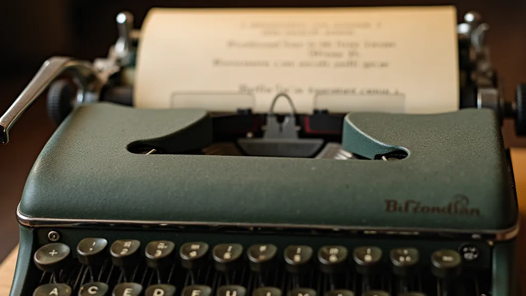
My own journey began with a battered Royal Quiet De Luxe. I’m not a collector in the strict sense; I’m drawn to the *feel* of these machines. The Quiet De Luxe, with its elegant curves and whisper-quiet operation (hence the name!), was a gift from my grandfather, a journalist who used it daily for decades. He’s gone now, but holding that machine, feeling the familiar resistance of the keys, connects me to his legacy and to the craft of storytelling itself. It sparked a desire to capture the specific *character* of that Royal - a certain roundedness to the letters, a slightly bolder presence than some of its contemporaries. That search for authentic reproduction isn't merely technical; it's a quest to understand the subconscious impact of these fonts – how they subtly influence our perception of text and meaning. There’s a certain emotional resonance that stems from recognizing the deliberate use of imperfections, a realization that the text wasn't simply "produced," but thoughtfully created within a constrained system.
Mapping the Landscape: Key Typewriter Models & Their Signatures
Before you start accumulating fonts, it’s crucial to understand the landscape. Different typewriter models developed distinct typefaces, each with its unique visual signature. Consider these a few prominent examples:
- Remington No. 12: Often considered the standard for early 20th-century typewritten documents. Its typeface is known for its slightly condensed letters and a certain formality. It's a great starting point for understanding the aesthetic of the era.
- Underwood No. 5: An iconic and widely used model. Its typeface has a more rounded feel compared to the Remington, and its ubiquity means it’s a common reference point for many designers.
- Royal Quiet De Luxe: As mentioned, known for its elegant design and slightly bolder, more rounded typeface. Recreating this font requires meticulous attention to the subtle curves and proportions.
- Oliver No. 6: Frequently used for legal documents due to its clear and legible typeface. It's a good choice when you need a font that conveys authority and precision.
- IBM Selectric: A revolutionary design featuring a “typeball” instead of traditional typebars. The Selectric typeface is instantly recognizable for its slightly more modern and streamlined look.
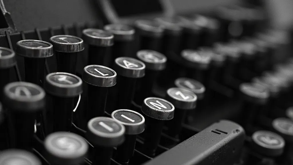
The research involved in recreating these fonts is surprisingly deep. It’s not simply about scanning a font sample; it requires understanding the mechanics of the typewriter – how the typebars were cast, how the ink ribbon interacted with the type, and even the subtle effects of paper texture. Sometimes, I'll spend hours just studying a single letter, comparing it to others, noting minute differences in stroke width or height. This process isn't just about technical accuracy; it’s about capturing the *spirit* of the machine. The influence of these machines extends beyond the purely visual; they shape the rhythm and pace of our communication. The constraints inherent in their operation – the limited character set, the mechanical precision – force a deliberate and thoughtful approach to writing, an approach that resonates even in the digital age. There’s something profoundly elegant about the limitations of the system, and understanding those limitations is key to truly replicating the feeling of a typewriter document. Perhaps you're interested in understanding how the imperfections you're striving to capture ultimately communicate complex emotions? Consider the topic explored in Unveiling the Subconscious: Typewriter Fonts and Emotional Subtext, which delves into the subconscious impact of these fonts.
Beyond the Scan: The Art of Reproduction
The first step, of course, is obtaining a high-quality sample of the original typeface. This can be achieved through careful scanning of printed documents, or, even better, by creating your own test prints using the original typewriter. However, scanning is merely the beginning. The true artistry lies in translating that scanned image into a usable digital font. This involves painstaking vectorization – tracing each letter with incredible precision. It’s a process that demands patience and a keen eye for detail.
Then comes the crucial step of adding subtle imperfections. A perfect, pristine digital font will feel lifeless. The best reproductions incorporate the slight inconsistencies that characterize the originals – subtle variations in stroke width, a slight wobble to the letters, even the occasional “ink bleed.” I often use techniques like adding a tiny amount of random noise to the outlines, or subtly altering the kerning (the spacing between letters) to mimic the way the type bars would naturally shift. Embracing this philosophy of imperfection can extend beyond the font itself, influencing how you think about design as a whole. It’s about understanding that beauty isn't always about flawlessness. Want to explore that concept further? Read A Symphony of Imperfection: Finding Beauty in Flawed Digital Reproductions for a deeper exploration of this idea.
Building Your Collection: Resources & Considerations
There are numerous digital typewriter font collections available online, but their quality varies greatly. Some are generic facsimiles, lacking the nuance and authenticity of the originals. Others are simply poor scans, lacking the resolution and clarity needed for professional use.
Here are a few things to consider when building your collection:
- Licensing: Always check the licensing terms before using any digital font. Some are free for personal use, while others require a commercial license.
- Quality: Look for fonts that have been meticulously reproduced, paying attention to detail and accuracy.
- Variety: Aim for a collection that represents a range of typewriter models, each with its unique aesthetic.
- Test Prints: Whenever possible, print out samples of the fonts and compare them to images of the original typewriters.
The process of curating a collection of digital typewriter fonts is more than just a technical exercise; it's a labor of love, a tribute to the ingenuity and craftsmanship of a bygone era. It's about preserving a vital piece of our visual history, ensuring that the unique character of these mechanical marvels continues to inspire and enrich our designs. And in a world increasingly dominated by digital perfection, there’s something profoundly satisfying about embracing the beauty of imperfection – one carefully reproduced character at a time. Consider, too, how choices in typography – and particularly typewriter fonts – shape our perception of the message itself. This is particularly relevant when aiming for a specific tone or feel. To really consider the visual language at play, you might want to explore The Palette of the Past: Curating a Visually Evocative Typewriter Font Collection for tips on building a collection that resonates with intention.