The Typographer's Lens: Deconstructing the Aesthetic of Historic Typewriter Models
There’s a certain melancholic beauty to the click and clack of a vintage typewriter. It’s a sound echoing with the ghost of stories untold, letters unsent, and creative endeavors birthed from mechanical precision. Beyond the nostalgic charm, however, lies a fascinating world of design and craftsmanship. Our digital font collection – "The Replica Typewriter Font Library" – isn't just about recreating lettering; it's about capturing the soul of these machines, understanding the unique aesthetic each model imparts, and preserving a tangible piece of history for the digital age.
For many of us, the image of a writer hunched over a typewriter is intertwined with notions of dedication, of painstaking effort, of a deliberate crafting of words. But the typewriter itself isn’t just a tool; it's an instrument with its own voice, a voice shaped by the ingenuity of its creators and the limitations – and opportunities – of its construction. It’s more than just black marks on paper; it’s a conversation between human intention and mechanical reality.
The Remington No. 1: A Foundation of Form
Let's begin at the genesis – the Remington No. 1, introduced in 1873. It’s remarkable to consider that this was the first commercially successful typewriter. Its typeface, stark and utilitarian, was a direct reflection of the era's industrial aesthetic. Unlike later models that adopted more refined curves and flourished details, the Remington No. 1's lettering is angular, almost brutal in its directness. The heavy serifs, while present, feel more like an afterthought, a concession to existing typography rather than an intentional design element. This isn’s about beauty, but functionality and communicating invention.
My grandfather, a skilled machinist, once explained to me the beauty he saw in the unadorned simplicity of well-engineered machinery. "It's honest," he’s said, tracing the lines of a discarded gear. "You see what it is, and you understand how it works." The Remington No. 1 typeface embodies that same honesty. The imperfections – the slight unevenness of the character spacing, the subtle variations in stroke weight – aren’t flaws; they are signatures of the process, testament to the hands that assembled each machine.
The Underwood 5: Embracing Elegance
The early 20th century brought a shift in design sensibility, and the Underwood 5, introduced in 1910, epitomizes this evolution. This was the typewriter that found its way into countless offices, classrooms, and homes, becoming synonymous with the act of writing itself. Its typeface, softer and more rounded than its predecessors, conveyed a sense of reliability and sophistication. The "Underwood Script" typeface, a later innovation, introduced a playful elegance that further solidified its popularity.
The shift in design wasn’t solely aesthetic. Technological advancements allowed for greater precision in casting the typefaces, allowing for more complex details and improved legibility. The Underwood 5’s escapement mechanism – the system that advances the carriage after each character is printed – was also significantly improved, making the typing experience smoother and less fatiguing. The impact wasn's just on the user, but on the cultural impact of accessible writing. The careful consideration of letterform design, and how it contributes to overall usability, is something that continues to inspire typeface designers today; an exploration we've detailed further when considering Beyond Novelty: The Enduring Power of Typewriter Fonts in Modern Writing.
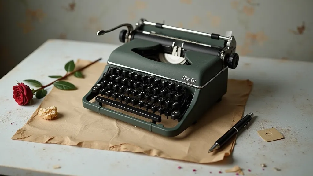
The Olivetti Lettera 32: A Masterpiece of Italian Design
The Olivetti Lettera 32, designed by Marcello Nizzoli and released in 1950, represents a pinnacle of Italian industrial design. This typewriter was more than just a machine; it was a work of art. The typeface, clean and minimalist, reflected the principles of the Modernist movement. The rounded forms, the balanced proportions, and the subtle details all contributed to a feeling of effortless elegance. The "Italia" typeface, specifically designed for the Lettera 32, is a study in understated sophistication.
My initial fascination with typewriters stemmed from an antique shop discovery. I was drawn to an Olivetti Lettera 32, its grey metal body gleaming subtly under the dusty light. The feel of the keys, the satisfying click of the mechanism – it was an almost tactile connection to another era. It made me realize that design isn't just about appearance; it’s about creating an experience, a feeling.
The Hermes 3000: A Legacy of Precision
The Hermes 3000, introduced in the 1960s, is revered by collectors and typists alike for its exceptional build quality and its unique typeface. This Swiss-made machine exemplified the principles of precision engineering. The typeface, known for its clarity and its distinct character spacing, is instantly recognizable. The slightly condensed proportions and the sharp serifs impart a feeling of understated authority. The subtle rhythm and pacing established by the typeface and the machine’s mechanics can significantly influence the overall feeling of a written piece. How the font interacts with the tempo of a narrative is something we've explored further in The Resonance of Keys: How Typewriter Fonts Shape Narrative Tempo.
Restoring vintage typewriters is a rewarding, albeit meticulous, process. It's not just about cleaning and lubricating the parts; it's about understanding the machine’s intricate workings, respecting its history, and preserving its character. Every typewriter tells a story, a silent narrative of its previous owners, the letters it typed, and the stories it helped to create.
The Digital Echo: Recreating the Legacy
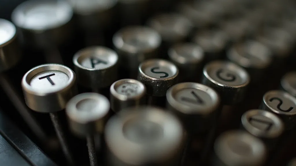
Our Replica Typewriter Font Library is more than just a collection of digital fonts; it's a labor of love, a dedication to preserving the legacy of these remarkable machines. We're not just recreating the lettering; we’re attempting to capture the essence of each model – the feel of the keys, the subtle imperfections, the unique character that defines its aesthetic. The nuances in the stroke weights, the irregularities in the letter spacing – these aren't errors; they are the fingerprints of the process, the echoes of history.
For graphic designers and typography enthusiasts, these fonts offer a unique opportunity to infuse their work with a touch of vintage charm, a connection to a time when writing was a more deliberate and considered act. The fonts are designed to be versatile, suitable for a wide range of applications – from posters and packaging to websites and social media graphics. Each font is presented with detailed notes on the original typewriter model it’s based on, including historical context and design features. The challenge of accurately representing the subtle distortions and variations inherent in these historical machines is considerable. It's a process of archaeological letterform discovery, akin to piecing together fragments of the past. We delve into the intricacies of font matching these iconic typewriter models and the fascinating world of letter archaeology in Ephemeral Echoes: Font Matching Typewriter Models and the Archaeology of Letters.
Beyond simply recreating the visual appearance, a deeper understanding of the manufacturing processes and the limitations of the technology at the time is crucial. The imperfect nature of early casting methods, the variations in metal density, and the mechanical constraints on the typebars all contributed to the unique character of each typeface. Recognizing and replicating these subtle imperfections is what truly brings these digital fonts to life. This level of detail and commitment to authenticity is what sets our Replica Typewriter Font Library apart.
The journey of creating these fonts begins with extensive research, often involving the physical examination of original typewriter models. We meticulously analyze every aspect of the typeface – the stroke weights, the letter spacing, the serifs, and the overall proportions. This painstaking process allows us to capture not only the visual appearance of the typeface but also the underlying character and spirit of the original machine. The technical challenges are considerable, but the reward of creating a digital replica that truly captures the essence of these remarkable machines is immeasurable.
The Replica Typewriter Font Library is an invitation to explore the fascinating world of antique typewriters, to appreciate the beauty of mechanical precision, and to connect with a legacy of creativity and innovation. It’s a chance to bring a piece of history to life, one keystroke at a time.
The process of translating a tangible, mechanical creation into a digital format presents unique design considerations. How do you convey the 'feel' of the keys, the subtle vibrations, the inherent imperfections of the machine? It's not enough to simply replicate the visual appearance of the typeface; you must also capture the intangible qualities that make each typewriter model so unique. We’ve approached this challenge with a meticulous attention to detail, striving to create digital fonts that are not only visually accurate but also evoke the sensory experience of using a vintage typewriter.
Ultimately, our goal is to provide graphic designers and typography enthusiasts with a powerful tool for creating authentic and compelling designs. Whether you’re working on a vintage-inspired poster, a classic-looking website, or a beautifully crafted book, our Replica Typewriter Font Library can help you capture the timeless elegance and charm of a bygone era.