The Palette of the Past: Curating a Visually Evocative Typewriter Font Collection
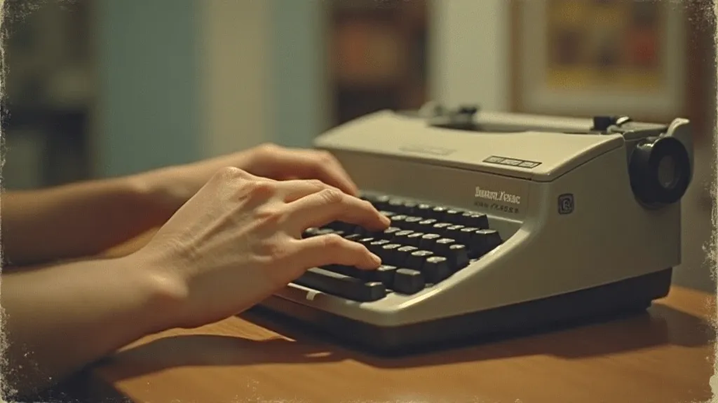
There’s a certain magic that clings to antique typewriters. It's more than just nostalgia; it's a palpable connection to a slower, more deliberate era of communication. Each ding of the carriage return, each perfectly formed letter struck against the paper, speaks of a considered process, a mindful creation. As a graphic designer, I’m constantly searching for ways to inject that authenticity, that tangible history, into my work. And for me, that journey often begins with the typeface – with the painstaking effort to recreate, as closely as possible, the specific character found on those beautiful, clattering machines.
Our collection, "The Replica Typewriter Font Library," isn’t just about providing digital fonts; it's about preserving a legacy. It’s about offering a carefully chosen palette of typefaces, each painstakingly reproduced from the specific lettering found on iconic typewriter models. These aren't generic "typewriter" fonts; they’re nuanced reflections of individual machines – the Underwood Standard, the Smith Corona Silent, the Olivetti Lettera 22, and countless others.
More Than Just Letters: Understanding the Craft
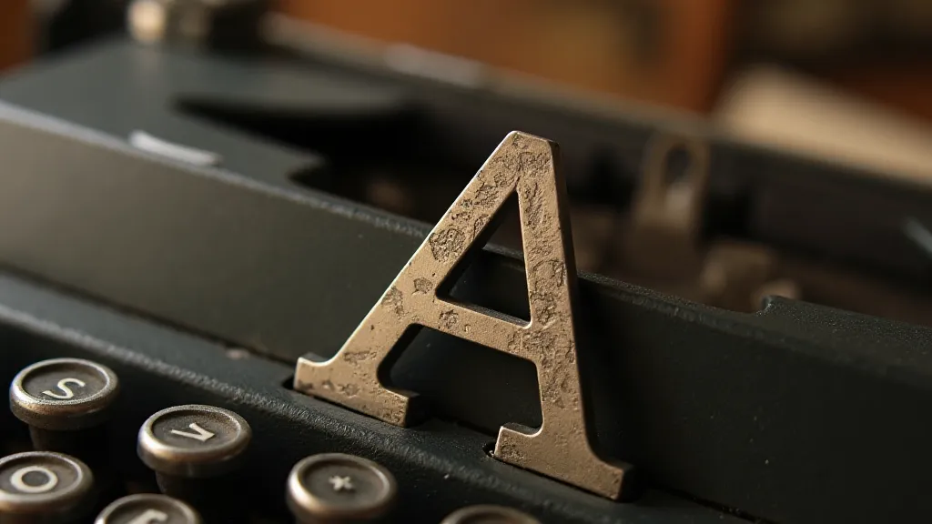
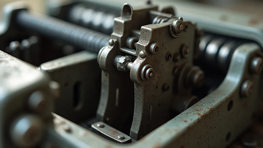
The process of recreating these fonts is far more complex than simply scanning a typeface and digitizing it. It requires a deep understanding of the mechanical limitations and idiosyncratic qualities of each machine. Typewriters didn't produce perfectly consistent letters. Variations in pressure, wear on the type slugs, and even the quality of the ribbon all contributed to subtle, yet crucial, differences. These imperfections, often considered "flaws," are precisely what give these fonts their character – their *soul*.
I remember my grandfather, a meticulous collector of antique typewriters. He's the one who truly sparked my fascination. He's a quiet man, rarely speaking of his collection beyond admiring its intrinsic beauty. He treated each machine with reverence, cleaning and lubricating them with a methodical care. Watching him, I realized that font reproduction wasn't simply about replicating the visual form, but about understanding the entire system that generated it – the mechanics, the materials, and the human hand involved in its creation.
A Curator's Eye: Harmonious Collections
When building a collection of typewriter font reproductions, it's important to consider the overall harmony of the set. Simply throwing a bunch of fonts together won’t create a compelling or visually coherent collection. Think of it like composing a musical score – each instrument needs to contribute to the overall effect.
First, consider the era represented. A collection focusing solely on early 20th-century machines will have a distinct feel – a certain formality and precision – different from a collection comprised of more modern, mid-century models. Next, pay attention to the personality of each font. Some are bold and assertive, while others are delicate and refined. Combining fonts with contrasting personalities can create visual interest, but it's crucial to maintain a sense of balance. A strong contrast can be visually striking, but too many jarring differences will feel chaotic.
Think about the intended use. A collection geared toward vintage advertising might benefit from bolder, more eye-catching fonts. A collection for crafting literary pieces would likely lean toward more understated and legible options. This isn't just about aesthetics; it’s about reflecting the spirit of the original machines and ensuring they serve their intended purpose in a contemporary context.
The Restoration Connection: A Journey of Discovery
The process of creating these font reproductions often leads to a deeper appreciation for typewriter restoration and preservation. Each font reproduction is informed by careful examination of original machines, often revealing unique details and quirks that might otherwise go unnoticed. The wear patterns on the type slugs, the subtle variations in the carriage return mechanism, even the scent of the aged ribbon – all contribute to a holistic understanding of the typewriter's character.
We’s not just aiming to copy the letters; we’re trying to understand the world that produced them. Sometimes, discovering a particular wear pattern on a type slug leads to a deeper question: what kind of documents was this typewriter used to produce? What stories does it hold?
Beyond Visual Appeal: The Emotional Resonance
Ultimately, a truly compelling typewriter font collection isn’t just about replicating the visual form; it’s about capturing the emotional resonance of these machines. It’s about evoking the feeling of crafting a letter by hand – the sense of deliberate creation, the connection to a simpler time.
Think about the countless letters, poems, and stories that have been typed on these machines. Each ding of the carriage return marks not just the end of a line, but a moment of thought, of communication, of human connection. And by faithfully recreating the typefaces of these machines, we hope to bring a little bit of that magic back to life.
The Ongoing Pursuit: A Living Archive
Our collection isn’t a static entity. It’s a living archive, constantly evolving as we discover new machines and refine our understanding of the originals. We are always searching for the next hidden gem – the next typeface that will add another layer of depth and character to our collection. We believe that these fonts aren't just tools for graphic design; they are portals to another era – a tangible link to the past, and a source of inspiration for the future.
The journey of recreating these fonts is a labor of love – a testament to the enduring appeal of craftsmanship and the power of human connection. And we invite you to join us on this journey, to explore the palette of the past, and to discover the magic of the typewriter font.