The Alchemy of Letters: Blending Typewriter Fonts for Unique Effects
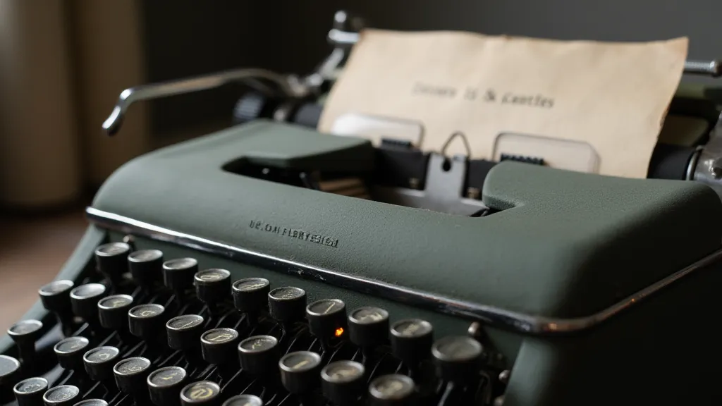
There’s a particular resonance that antique typewriters hold. It’s not just the clatter of the keys, the smell of aging metal and ink, or the tangible act of creation they represent. It’s the echo of countless stories, letters, poems, and manifestos imprinted on fragile paper by machines built to last. My grandfather, a meticulous engineer, possessed a Remington No. 4, its keys worn smooth by years of service. Watching him type letters – each strike a deliberate, almost ceremonial act – fostered in me a deep appreciation for the physicality of writing, a feeling lost in the ephemeral world of digital fonts. That feeling, that reverence, is what I strive to recapture when working with typewriter font reproductions.
The digital realm offers a remarkable opportunity to preserve and recreate the character of these machines. Our collection isn't simply about providing digital approximations; it’s about capturing the soul of each model – the subtle imperfections, the idiosyncratic letterforms, the unique ‘voice’ each typewriter possesses. And that voice, as it turns out, becomes even more compelling when blended with others.
The Symphony of Imperfection: Why Blending Works
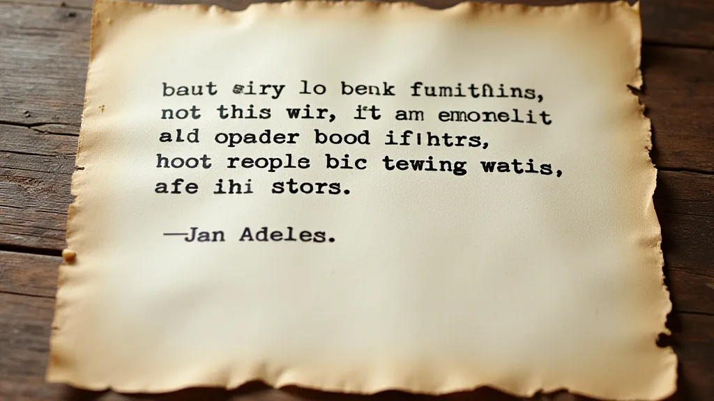
Modern typography often emphasizes precision and consistency. Every letter is identical, perfectly aligned, flawlessly rendered. But the beauty of a typewriter font lies precisely in its imperfections. Variations in strike depth, uneven spacing, and even the occasional smeared ink dot contribute to its distinctive charm. These inconsistencies aren’t flaws; they're fingerprints, evidence of the machine’s history and the human touch involved in its use. Thinking about the nuances of imperfection and how to best utilize them is a frequent topic of discussion with our design team, reminding us of the core philosophy behind our font reproductions. For those interested in exploring this concept further, you might appreciate reading about breathing life into the page and finding beauty in flawed digital reproductions. The idea that these perceived flaws are actually integral to the font’s character is a core tenet in our approach; it's a concept explored deeply in articles like Ink-Stained Memory: Why Imperfection is the Poetry of Typewriter Fonts, where we delve into the artistic merit of embracing the quirks inherent in vintage typewriters.
When you combine different typewriter fonts, you’re essentially layering these imperfections. A few moments ago, you were looking at an Olivetti Lettera 32, with its graceful, almost calligraphic letterforms. Now, imagine juxtaposing that elegance with the more robust, almost industrial character of a Remington Standard. The contrast isn't jarring; it's a conversation. The Olivetti brings a touch of refinement, while the Remington adds a grounding weight. It’s like harmonizing two different instruments in an orchestra – each contributes to a richer, more nuanced overall sound. The impact of these combinations is something we continually strive to understand and refine, always seeking to honor the original machines and the stories they tell.
A Historical Palette: Matching Fonts to Narrative
The choice of typewriter font can profoundly influence the emotional impact of a project. A 1920s Underwood, for example, carries a specific historical weight – the Jazz Age, the Roaring Twenties, the rise of modernism. It evokes images of smoky speakeasies, bootleg whiskey, and the optimistic fervor of a generation striving for a new world. Pairing a font reproduction of that model with a bold, experimental layout can instantly transport your audience to that era. The depth of historical context embedded within each model is truly remarkable, and understanding this history is essential for any designer seeking to create authentic and meaningful work.
Conversely, a more utilitarian Royal Quiet De Luxe, popular in the mid-20th century, suggests a different tone – one of quiet efficiency, of post-war prosperity, of the burgeoning middle class. Its clean lines and consistent typeface lend themselves well to conveying a sense of stability and reliability. Imagine the stories those machines could tell - personal reflections, urgent correspondence, quiet moments of creativity. This legacy of function and form speaks to a time when machines were not merely tools, but symbols of progress and aspiration. The sheer weight of history contained within these relics continues to inspire us in our restoration and reproduction efforts.
Consider a piece of historical fiction. To accurately convey the feeling of a letter written during the American Civil War, combining a simple, workhorse Remington with a more personal, hand-adjusted Hermes 3000 might be incredibly effective. The Remington represents the bureaucracy and the formal aspect of communication, while the Hermes hints at the writer’s individual perspective and emotional investment. It's not about finding the *perfect* match; it’s about creating a resonant combination that enhances the narrative. This layering of historical context and emotional nuance is a cornerstone of crafting truly compelling narratives. The feeling of authenticity achieved through careful font selection elevates the entire narrative experience, drawing the reader deeper into the story and its historical setting.
The Craft of Restoration & Collecting: A Deeper Connection
My passion for typewriter fonts stems from a broader interest in restoration and collecting. There's a profound satisfaction in bringing a neglected machine back to life – carefully cleaning its intricate mechanisms, replacing worn parts, and witnessing it begin to function once more. Each machine has a story to tell, and these stories are often etched into its metal and embedded within its ink-stained keys. This process of uncovering the past, understanding the mechanics, and appreciating the artistry is deeply fulfilling.
Restoration isn't just about mechanical repair; it’s about preserving a piece of history. It’s about understanding the ingenuity of the engineers who designed these machines and the craftsmanship of the workers who assembled them. The same care and attention to detail that goes into restoring a typewriter should inform the selection and application of its digital font reproduction. It’s about honoring the legacy of the machine and the stories it has helped to tell. The attention to detail involved in restoring a vintage machine is remarkable, a testament to an era of robust engineering and lasting design. For those deeply fascinated by this meticulous process, you might find “The Relic's Resonance: Capturing Authenticity with Digital Typewriter Reproductions” a compelling read, exploring the intricacies of recreating the feel and function of these remarkable machines.
Experimentation & Nuance: Beyond the Basics
Don't be afraid to experiment. While historically accurate pairings can be deeply evocative, sometimes the most compelling combinations arise from unexpected juxtapositions. Try blending a bold, industrial font with a more delicate script. Combine a serif font with a sans-serif. The possibilities are endless. Just be mindful of the overall effect you’re trying to achieve. The art of blending fonts is not merely about aesthetics; it's about creating an emotional resonance, a feeling that connects the reader to the story.
Pay attention to kerning and leading. The spacing between letters and lines can drastically alter the appearance of a font. Adjust these settings to create a more harmonious and readable composition. A subtle change in kerning can completely transform the feeling of a piece.
Consider using different weights and styles. A bold font can add emphasis, while an italic font can convey a sense of urgency or elegance. Layering different weights of the same font can create a subtle sense of depth and texture. This layering can add layers of complexity and richness to a document.
Beyond Mimicry: A Modern Voice Rooted in the Past
Ultimately, our collection of typewriter font reproductions is about more than just recreating the appearance of vintage machines. It’s about capturing their spirit, their character, their unique voice. By blending these fonts creatively, you can add a layer of depth and richness to your writing, creating a connection with the past while forging a modern voice. The goal is not to simply replicate the past, but to use it as a springboard for something new and innovative. Understanding how these fonts impact reader perception, as explored in Echoes in the Machine: How Typewriter Fonts Influence Reader Perception, is crucial for crafting truly impactful and resonant narratives.
The clatter of keys may be a fading sound, but the stories they helped to tell continue to resonate. And with a little imagination and a carefully chosen combination of typewriter fonts, you can help to keep those stories alive. The enduring appeal of these machines lies not just in their mechanical beauty, but in the legacy of human expression they represent. For those seeking to explore the broader implications of design and legacy, you may find The Quill's Digital Heir: Reimagining Legacy Through Typewriter Fonts to be a worthwhile read.