Echoes in the Machine: How Typewriter Fonts Influence Reader Perception
There’s a certain weight to history that you can almost *feel* when you hold an antique typewriter. More than just metal and keys, these machines represent a period of profound cultural and technological shift – the rise of mass communication, the democratization of writing, and a distinct aesthetic that permeates the very air surrounding them. And, perhaps unsurprisingly, that aesthetic profoundly influences how we perceive the words produced—or, in our modern context, reproduced—using typewriter font reproductions.
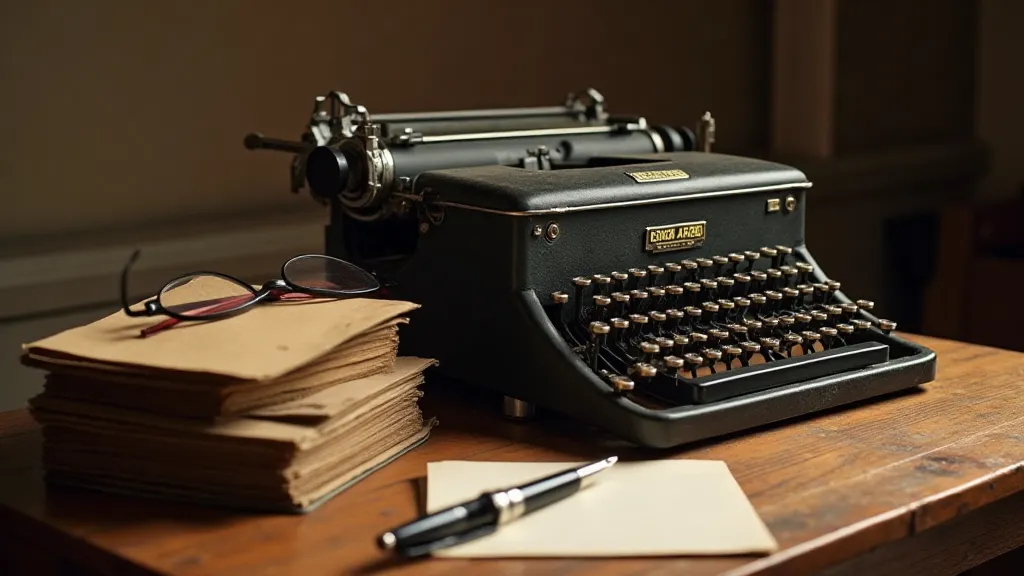
My grandfather, a seasoned journalist, kept an Underwood No. 5 on his desk. It wasn’t just a tool; it was an extension of his voice, a witness to countless stories unfolding. The clatter of its keys wasn’t noise; it was the soundtrack of his profession. I remember being captivated by the imperfections – the slight variations in ink density, the occasional misalignment, the subtle quirks that marked each page as uniquely, authentically typed. Those imperfections weren’t flaws; they were character, texture, a tangible connection to the human hand that had crafted them.
The Legacy of the Keys: A Brief History
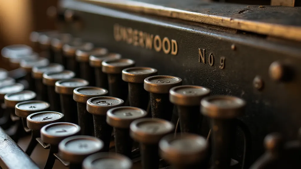
The invention of the typewriter in the mid-19th century revolutionized communication. Before, written correspondence was largely the domain of the wealthy and educated, meticulously handwritten with elegant script. The typewriter shattered that barrier, allowing for faster, more legible, and more accessible writing. Early models, like the Sholes & Glidden, were clunky and unreliable, but they quickly evolved, each iteration refining both the mechanics and the typeface itself. The Remington No. 2, the Underwood, the Royal – each of these machines became cultural icons, synonymous with efficiency and modernity.
The fonts themselves were a direct consequence of the mechanical limitations of the time. Typewriter fonts were born from the need for robust, easily-reproduced characters that could reliably imprint onto paper. The iconic “pica” and “elite” typefaces, still instantly recognizable, are testaments to this era. They weren’t designed for artistic flourish; they were engineered for function, resulting in a unique aesthetic – a blend of utilitarianism and unexpected beauty. The impact of these early designs continues to influence design choices even today, as we explore how choosing a typewriter font can significantly shape a piece’s character and depth.
The Psychological Impact of Typewriter Fonts
So, how does this historical context translate to the modern reader? It's more than just nostalgia; it's a subconscious response to a visual language that carries significant cultural weight. Typewriter fonts trigger associations with authenticity, intimacy, and a sense of direct communication. Unlike the polished precision of many modern digital fonts, the slightly uneven lines and the inherent “texture” of a typewriter font suggest a human touch. This perceived imperfection fosters a sense of trust and engagement.
Consider the difference between reading a formal legal document in Helvetica and reading a personal letter in a typewriter font reproduction. The former evokes a sense of formality and detachment; the latter feels more personal, almost as if the writer is confiding in you. This difference stems from the psychological associations we’re conditioned to make. The slight inconsistencies, the subtle imperfections—these are not drawbacks; they are features that enhance the feeling of genuine connection.
The feeling of authenticity is particularly relevant in an age of digital fabrication. We are bombarded with images and text meticulously crafted to project a particular image. Typewriter fonts, with their inherent limitations and the visual suggestion of manual creation, offer a refreshing counterpoint – a glimpse into a time when writing was a more tangible, more deliberate act. They offer a way to connect with readers on a more profound level, hinting at a story's origins and imbuing it with a sense of lived experience. The careful selection of typography can influence not just how a reader *sees* a piece, but how they *feel* about it. Sometimes, the power of these fonts lies in their ability to transport readers to another time, much like exploring a "typographic time capsule."
Restoration & Preservation: A Labor of Love
The craft of restoring antique typewriters is a fascinating blend of mechanical skill and appreciation for history. It’s not merely about repairing broken parts; it’s about preserving a piece of cultural heritage. Collectors meticulously clean, lubricate, and replace worn components, often sourcing original parts from other machines. Each restoration is a labor of love, a testament to the enduring appeal of these machines.
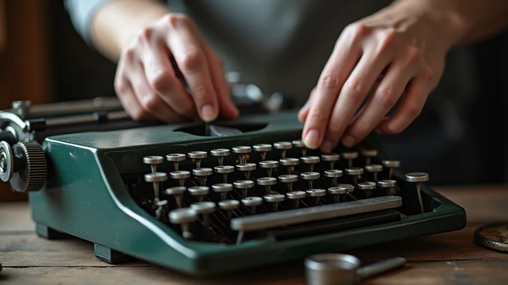
The same attention to detail applies to recreating the digital typewriter font reproductions available today. It's not simply a matter of scanning a typeface and converting it to a digital format. True reproductions involve painstaking analysis of the original typebars, accounting for subtle variations in stroke width, kerning, and alignment. The goal is to capture not just the visual appearance of the font, but also the *feel* of it – the subtle nuances that contribute to its unique character.
Beyond the Aesthetic: Considerations for Modern Design
While the nostalgic appeal of typewriter fonts is undeniable, it’s important to consider their functional limitations in modern design. The relatively narrow x-height and the generally condensed letterforms can make them less readable at smaller sizes. However, with careful kerning and appropriate line spacing, these limitations can be mitigated.
Furthermore, the “texture” that makes typewriter fonts so appealing can also become a distraction if overused. A subtle touch is often more effective than a heavy-handed application. Pairing a typewriter font with a clean, modern typeface can create a visually striking contrast that enhances both fonts.
The careful deployment of these fonts can dramatically alter the perceived pace of a story. Sometimes, a faster pace is desired to create suspense or excitement. Other times, a slower pace helps to evoke a sense of melancholy or reflection. Understanding how typography influences this aspect of narrative is crucial for any writer seeking to fully control the reader's experience. For a deeper understanding of how typeface choices can dictate how typewriter fonts shape narrative tempo, further exploration is highly recommended.
The Enduring Legacy
The clatter of the keys, the faint scent of ink, the subtle imperfections – these are the sensory hallmarks of a bygone era. While the antique typewriters themselves may be relics of the past, their legacy lives on in the digital fonts that attempt to capture their essence. Those reproductions offer more than just an aesthetic choice; they provide a portal to a time of profound cultural and technological change, a connection to the human hand that shaped the written word. They remind us that even in the age of digital perfection, there’s something uniquely compelling about the echoes of the machine.
Ultimately, the choices we make about typography reflect our broader creative goals. Do we aim to create a sense of familiarity and comfort? Or do we seek to disrupt expectations and challenge conventions? The possibilities are vast, and the rewards are well worth the effort. It’s not merely about choosing a font; it’s about telling a story—a story that transcends the words themselves.
And, in an age of digital overload, that connection can be profoundly valuable. The ability to evoke a sense of shared experience, a feeling of authenticity—these are the qualities that truly resonate with readers. The visual language we employ must be both technically proficient and emotionally engaging. The best typography is that which disappears—allowing the story itself to take center stage.
Examining how we approach these decisions can illuminate a profound truth: the history of typography is inextricably linked to the history of human communication. By understanding the origins of these fonts, we can gain a deeper appreciation for the power of visual language—and its ability to shape our perceptions of the world. Understanding these nuances can also provide insight into how typewriter fonts can invoke subconscious reactions, adding another layer of meaning to the reader's experience.