Breathing Life into the Page: Choosing a Typewriter Font for Character Depth
There’s a certain melancholy, a quiet dignity, in the hum of a vintage typewriter. It’s more than just the clatter of keys; it's the echo of countless stories poured onto paper – letters of longing, manifestos of revolution, the hesitant first drafts of beloved novels. When we seek to capture a character's essence in our writing, especially those deeply rooted in the past, relying solely on modern, sleek fonts often falls short. We risk missing a vital layer of emotional resonance. The right typewriter font can be more than just a stylistic choice; it can be an embodiment of a character’s history, their temperament, and the world they inhabit.
The Legacy of Mechanical Typewriters
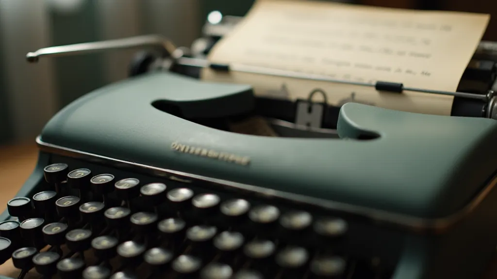
The story of the typewriter itself is a fascinating one, intertwined with innovation, social change, and the rise of the modern office. Before computers and word processors, these mechanical marvels democratized writing. Suddenly, documents looked clean and professional, independent of the scribe’s handwriting. Consider the Remington No. 1, introduced in 1874, a pioneering machine that looked more like a sewing machine than a writing tool. Or the elegant Underwood No. 2, a workhorse of the 20th century, instantly recognizable for its rounded, upward-angled frame. Each model possessed a unique typeface, a distinct personality cast into metal. These weren’t just fonts; they were signatures, etched into the fabric of the written word. Understanding the nuances of these fonts and the era they represent can truly enrich your storytelling – a concept explored further in Ephemeral Echoes: Font Matching Typewriter Models and the Archaeology of Letters.
I remember my grandfather, a retired history professor, and his well-worn Royal Quiet De Luxe. The scent of aged metal and paper clung to it, a comforting aroma. He’s the one who first sparked my interest in these machines. He's explained the subtle nuances of each typeface: the assertive boldness of the Shultens typeface used by early Remingtons, the more refined curves of the Underwood, the sturdy simplicity of the Olivetti Lettera 22. It wasn't just about the look; it was about the feeling.
Beyond Aesthetics: Matching Font to Character
So, how do we translate this appreciation for antique typewriters into a useful tool for character development? It's about understanding the psychological association we have with these fonts. A character who is a hardened detective, haunted by a tragic past, might be well-suited to a typeface with a slightly distressed, industrial feel – perhaps mimicking a Remington Standard, known for its utilitarian design and slightly uneven impression. Its directness conveys a sense of gruff honesty and unflinching resolve. Conversely, a romantic poet, writing delicate verses filled with longing and beauty, might benefit from a more graceful font like the Underwood No. 2, where the curved letterforms evoke a sense of fluidity and artistic sensibility. The relationship between a font's history and the voice of the character writing with it is a complex and compelling one, and examining these connections can unlock new layers of depth in your narrative. Delving into the notion that fonts possess a certain “soul” and can be a portal to understanding lost voices, as considered in The Scribing Soul: Typewriter Fonts as a Portal to Lost Voices, can further refine your character choices.
Let’s consider a character who is a meticulous archivist, dedicated to preserving history. Their correspondence, filled with detailed records and scholarly notes, demands a typeface that embodies order and precision. The IBM Selectric typeface, with its distinctive "golf ball" printing element, would be an appropriate choice. It speaks to a commitment to accuracy and a reverence for detail, echoing the archivist’s own meticulous nature. It’s important to remember that the choice isn’t simply about aesthetics; it’s about creating a connection between the font and the character's very essence – how the act of writing itself shapes their personality and perception of the world.
Don’t be afraid to experiment. The “perfect” font rarely exists in a vacuum. It's a matter of subjective interpretation and how it interacts with the overall tone of your writing. A slightly worn or imperfect font can actually enhance a character's story, hinting at a life lived outside of pristine circumstances. A font that evokes a specific era can instantly transport the reader to a different time and place, immersing them in the character’s world. The seamless integration of font choice and writing flow is paramount to creating an immersive and believable narrative. Those interested in exploring this concept further might find valuable insights into Beyond the Aesthetic: The Ergonomics of Typewriter Fonts and Writing Flow.
The Craftsmanship Behind the Typeface
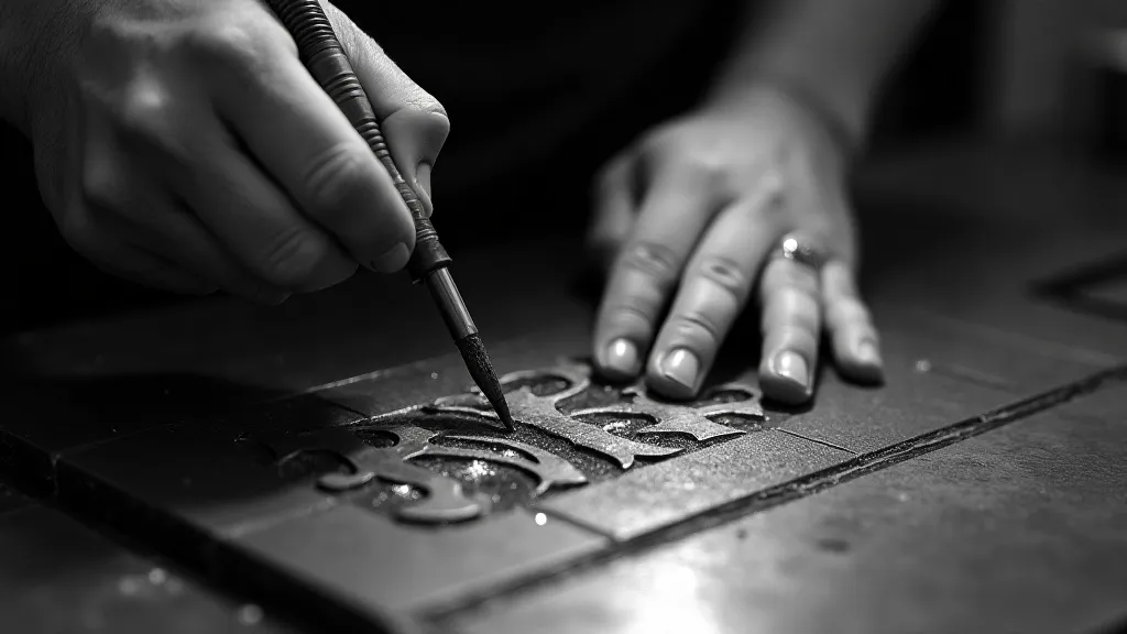
The creation of a typewriter typeface was a painstaking process. Engravers would meticulously carve each letter into a matrix, a steel block that would later be used to cast the type metal. The precision required was extraordinary; even a tiny imperfection could affect the appearance of the printed text. This legacy of craftsmanship is evident in the subtle quirks and imperfections that characterize these vintage typefaces, distinguishing them from the often-sterile uniformity of modern digital fonts. These imperfections, far from detracting from the typeface's appeal, add a unique character and authenticity that is often missing in digitally produced fonts. They are a tangible reminder of the human effort and artistry involved in their creation. Finding beauty and appreciating these flaws, as discussed in A Symphony of Imperfection: Finding Beauty in Flawed Digital Reproductions, can expand your creative perspective when selecting a font.
Restoring or collecting antique typewriters is an increasingly popular hobby. While demanding, it's a rewarding way to connect with the history of these machines and to appreciate the artistry that went into their creation. Even a superficial understanding of the mechanics and history of these machines can add depth to your writing. The tactile experience of using a typewriter, the feel of the keys and the sound of the mechanism, all contribute to the overall impression and can evoke a sense of nostalgia and connection to the past.
Finding and Utilizing Replica Typewriter Fonts
Fortunately, many talented font designers have dedicated themselves to recreating these vintage typewriter typefaces digitally. A wealth of “typewriter font reproductions” are readily available online, often meticulously crafted to match the original designs. When selecting a replica font, pay close attention to the details. Look for fonts that capture the characteristic imperfections – the slightly uneven kerning, the subtle variations in stroke weight, the occasional “ink blot” or “smudge” that adds authenticity to the impression. The quest for authenticity in these reproductions is a continuous effort, as designers strive to capture the essence of the original typefaces.
Consider the overall atmosphere you'd like to achieve. Are you aiming for a raw, gritty feel, or a more elegant, refined aesthetic? Does the character’s background suggest a specific brand of typewriter? Doing some simple research can have a significant impact on the quality of the final project. Understanding the historical context and the specific characteristics of each typeface can allow for a more informed and nuanced decision. For example, knowing that the Remington Standard was often associated with industrial settings can guide the selection of fonts that evoke that same atmosphere.
Beyond the Letterform: The Impression of Time
Ultimately, the choice of typewriter font is just one piece of a larger puzzle. The true magic happens when you combine that choice with thoughtful prose, well-developed characters, and a compelling narrative. But even the most brilliant story can be elevated by the right font—a quiet testament to the enduring legacy of the mechanical typewriter and its profound influence on the written word. Let the clatter of the keys, and the whisper of history, guide you. The power of typography extends far beyond mere aesthetics; it's a vital tool for shaping the reader's perception of the story and the characters within it. The careful selection of a font that complements the narrative can create a truly immersive and unforgettable reading experience.