Beyond Novelty: The Enduring Power of Typewriter Fonts in Modern Writing
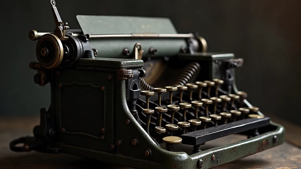
There’s a particular scent that clings to old things—a subtle blend of dust, aged paper, and something indefinably…historical. I first encountered it as a child, rummaging through my grandfather’s attic, filled with forgotten treasures. Among them, tucked away in a dusty corner, sat an Underwood Standard, its keys frozen in time. I never learned to truly *use* it—the ribbon was long gone, and my grandfather wasn’t one for explanations—but the visual impression lingered. The simple elegance of the metal, the satisfying *clunk* of the keys (even when frozen), and the ghost of stories whispering from its silent keys…it sparked a fascination that continues to this day. And a significant part of that fascination, surprisingly, has manifested in my work as a graphic designer, through the captivating world of typewriter fonts.
We often associate typewriter fonts with a superficial retro aesthetic, a trendy shortcut to a "vintage" feel. But to reduce them to mere novelty is to miss a profound aspect of their enduring power. These fonts aren't simply mimicking a visual style; they're embodying an era—a specific time in history, a particular mode of communication, and a certain human effort. They represent a moment when every word was meticulously considered and physically committed to paper, a tangible representation of thought.
The Craftsmanship Behind the Letters
Consider the mechanics. Early typewriters weren’t driven by digital algorithms. Each letter was a precisely engineered piece of metal, painstakingly cast and arranged. The typeface itself wasn't a fleeting digital construct; it was a physical form, designed with intention and limitations. The slant, the spacing, the imperfections – all were consequences of the manufacturing process, and these quirks are now intrinsic to their character. Our digital reproductions strive to capture this exact character, meticulously analyzing the physical typefaces of specific models – the Remington No. 10, the Olympia SM9, the IBM Selectric – to recreate the subtleties that define them.
This dedication goes beyond simply recreating the letterforms. It’s about understanding the spacing, the kerning (the space between individual letters), and the overall rhythm of the typeface as it was intended to appear on paper. A Remington No. 10 font, for instance, has a distinct “feel” compared to an Olivetti Lettera 32. The spacing is different, the stroke weights subtly vary, and even the overall impression of the typeface is unique. To truly capture the essence of a typewriter, one must appreciate these nuances. It’s a journey that often leads to deeper appreciation for the entire collection and the variety of approaches designers took to creating readable and appealing text—a fascinating topic explored further in articles examining the palette of the past and the creative approaches to curating truly evocative collections.
More Than Just Nostalgia: Applications in Modern Writing
So, how can these fonts be effectively employed in contemporary writing? The answer is surprisingly varied. While they are undoubtedly suited to projects with a vintage or historical theme – book covers for period pieces, advertising campaigns evoking classic elegance – their versatility extends far beyond simple nostalgia. Think about a project that demands authenticity and a sense of deliberate communication. A newsletter from a small business emphasizing handmade quality? A manifesto from an organization dedicated to slow living? A wedding invitation seeking to convey timeless romance? These are all instances where a carefully chosen typewriter font can add a layer of depth and meaning. The potential for blending and experimenting with various typewriter styles to create truly unique and compelling visual narratives is also vast; something that deserves deeper consideration and exploration - many creative visual effects are born from understanding the alchemy of letters and how different styles interact.
Furthermore, the inherent limitations of these fonts can be a creative advantage. The fixed width, the lack of bold or italic options (unless cleverly simulated), forces a level of intentionality in the design process. It encourages careful word choice and a conscious arrangement of text. It's a departure from the often-overwhelming flexibility of modern digital typography, pushing the designer (and the writer) to think more critically about every character on the page.
Restoration and Collecting: A Window into the Past
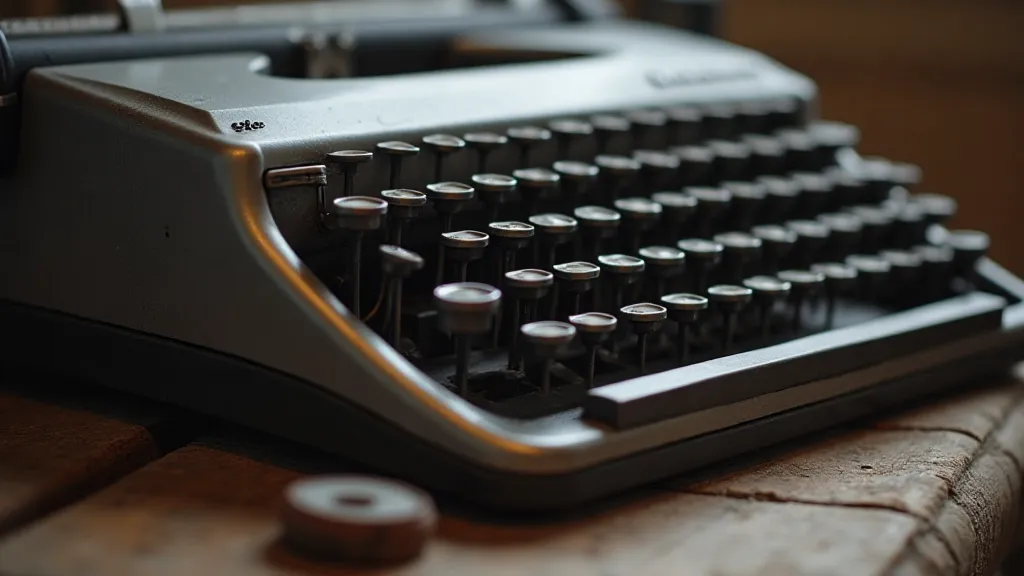
My interest in typewriter fonts naturally led me to an appreciation for the machines themselves. Restoring a typewriter is a uniquely satisfying endeavor. It’s not simply about repairing broken parts; it’s about preserving a piece of history, breathing new life into a mechanical marvel. Each restored machine tells a story – a story of its previous owners, the letters it typed, and the moments it witnessed. The delicate dance of finding replacement parts, cleaning and oiling the intricate mechanisms, and ultimately hearing the satisfying clatter of a restored machine is a deeply rewarding experience.
Collecting typewriters, too, offers a fascinating glimpse into design and engineering history. Each model represents a specific era and a particular approach to solving the challenges of mechanical writing. From the early, clunky models to the sleek, electric machines of the mid-20th century, each typewriter embodies a unique aesthetic and a specific moment in technological innovation. The subtle variations in typeface, the evolution of the mechanics, and the changing design trends offer a rich and rewarding area of study. The echoes of those past voices, preserved within the machinery, provide a powerful connection to the human experiences that shaped our present – a poignant resonance that speaks to the scribing soul.
Beyond the aesthetic considerations, understanding the mechanical intricacies of these machines reveals a commitment to craftsmanship and ingenuity rarely seen in our digital age. These weren’t mass-produced items; they were crafted with a dedication to detail, reflecting a time when functionality and beauty were intrinsically linked. The tangible connection to the people who used and maintained these machines—the writers, the repairmen, the collectors—adds a layer of depth and meaning that transcends mere visual appeal.
The Future of Typewriter Fonts
As digital technology continues to evolve, the appeal of these older, more analog aesthetics seems unlikely to diminish. In a world saturated with perfectly rendered fonts and customizable design tools, there’s a certain charm in embracing the imperfections and limitations of the typewriter. Our digital reproductions will continue to evolve, incorporating new technologies to more accurately capture the subtleties of these iconic typefaces. We’ve begun experimenting with simulating the slight inconsistencies in ink distribution found on original ribbons and incorporating the subtle variations in letter height and width that are characteristic of older models.
The technical challenges of accurately replicating the unique characteristics of these typefaces are significant. Recreating the feel of the dampened ribbon, the slight variations in ink density, and the subtle imperfections in the letterforms requires a deep understanding of the original manufacturing processes. It's not simply about creating a visually similar font; it's about capturing the *essence* of the typewriter – the weight of the metal, the clatter of the keys, the feeling of permanence.
The increasing availability of high-resolution scans and detailed technical documentation has allowed us to refine our reproductions even further, incorporating subtle nuances that were previously unattainable. We are also exploring new techniques for simulating the tactile feedback of a real typewriter, using haptic technology to create a more immersive and authentic user experience. The pursuit of accuracy is a continuous process, driven by a desire to honor the legacy of these remarkable machines and the people who used them.
The appeal of typewriter fonts extends beyond the design world. They have found a place in education, providing students with a unique way to engage with writing and history. The limitations of typewriter fonts can encourage students to be more deliberate in their word choice and to pay closer attention to the visual impact of their writing. The tactile experience of using a typewriter can also be a powerful learning tool, providing a sense of connection to the past and a deeper appreciation for the art of writing.
The enduring legacy of typewriter fonts is a testament to the power of simplicity and authenticity. In a world of ever-increasing complexity, these fonts offer a welcome respite – a reminder of a time when communication was more deliberate, more personal, and more meaningful. They are more than just novelty fonts; they're vessels of history, embodiments of craftsmanship, and invitations to a slower, more considered way of communicating. The detailed investigation into how each model functions and contributes to the overall aesthetic journey reinforces the concept that the pursuit of authenticity often requires a return to the foundational principles that drove innovation – a fundamental truth explored with further detail in analyses of the relic's resonance and the preservation of accurate reproductions.