The Ghost in the Pixel: Reclaiming the Resonance of Antique Typewriter Fonts
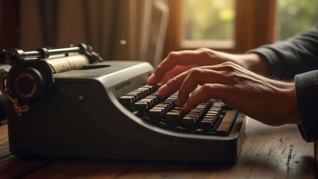
There’s a peculiar sort of melancholia that clings to the keys of an antique typewriter. It's more than nostalgia, though the romance of a bygone era certainly plays a part. It's a feeling of connection – to the hands that hammered out letters, the stories they told, the very air of a different time. And that feeling, that resonance, is something we’re trying to capture, pixel by painstaking pixel, in our collection of typewriter font reproductions.
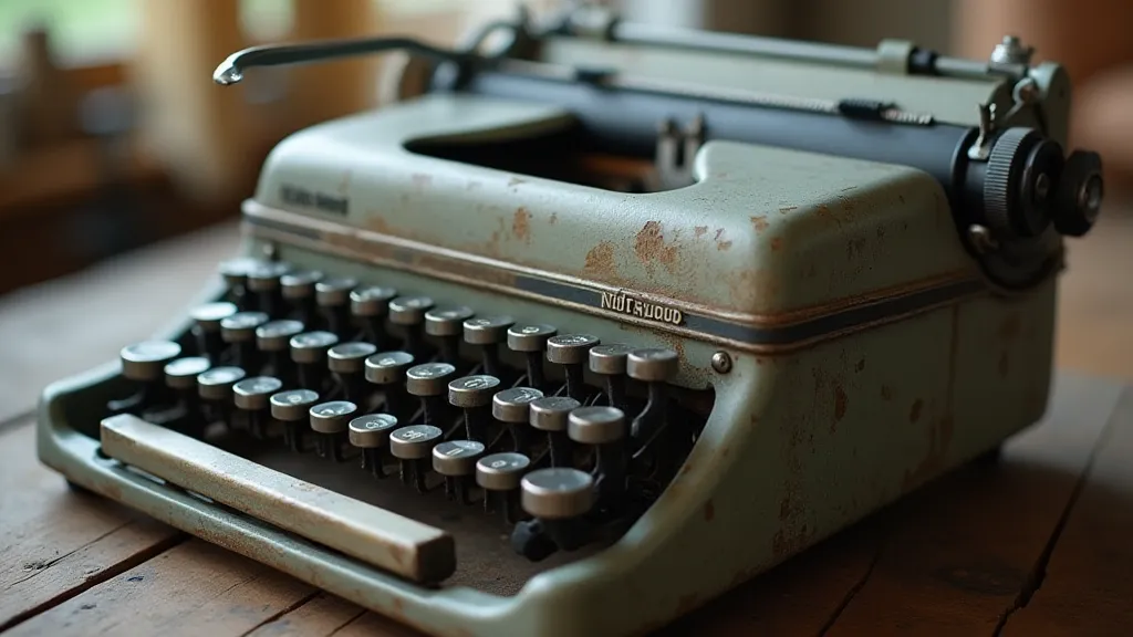
I remember finding my grandfather’s Underwood No. 4. It wasn't a grand discovery; it was tucked away in a dusty corner of the attic, seemingly forgotten. He's gone now, but the typewriter wasn’t discarded. It had simply been put away, a silent witness to decades of family life. The keys were stiff, the ribbon long faded, but the smell – that unique combination of metal, ink, and aged paper – instantly transported me back. It wasn’t just an object; it was a portal.
That moment sparked a fascination. I started researching the machine, learning about its history, its manufacturing process, the nuances of its typeface. It wasn’t just about aesthetics; it was about understanding the craftsmanship, the purpose, the soul of that machine. That’s the challenge we face when recreating these typefaces digitally: to capture not just the visual appearance, but also the feeling of authenticity that comes from the limitations and imperfections inherent in the original.
Beyond Aesthetics: The Importance of Imperfection
Modern digital fonts are often designed for absolute clarity and consistency. Every letter is perfectly formed, uniformly spaced, and flawlessly aligned. While that precision has its place, it's a far cry from the character of an original typewriter typeface. Those early typefaces weren’t designed with kerning tables or optical adjustments. They were carved into metal matrices, cast into type, and subjected to the inevitable wear and tear of use. The history of typeface design isn't just about elegant curves and perfectly balanced serifs; it's about understanding the tools and techniques that shaped them.
Consider the Remington No. 12, a workhorse of the mid-20th century. Its font, often associated with classic journalism and correspondence, boasts a certain robustness and authority. But the type isn’t perfectly symmetrical. There are subtle variations in stroke weight, minor misalignments, and a slightly uneven baseline – all the result of the casting process and the metal's inherent properties. To replicate that accurately, we’s had to analyze samples of original type, measuring minuscule variations and incorporating them into the digital font. It’s an exercise in reverse engineering not just the look of the font, but the manufacturing process itself. Understanding these nuances is crucial – and the craft extends far beyond what meets the eye, demonstrating how bringing a legacy font to life takes a deep appreciation for its inherent story.
Similarly, the Olivetti Lettera 22, famed for its elegance and portability, presented its own challenges. Its typeface, with its distinctive serifs and delicate proportions, possessed a certain refinement. Yet, even that refined beauty was subject to imperfections. The slight wobble of a letter, the subtle unevenness in the spacing – these weren’t flaws; they were characteristics. They contributed to the typeface’s unique personality. It’s through appreciating these characteristics, understanding how they shaped the font's identity, that we can truly honor its heritage, breathing new life into a timeless creation.
The Craft of Reproduction: A Labor of Love
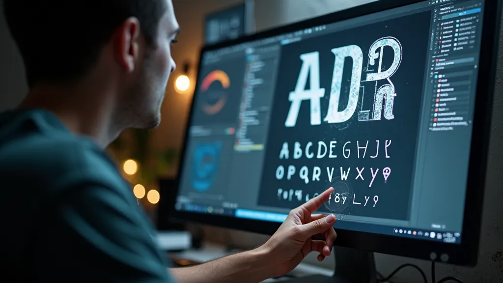
Creating these digital reproductions isn’t simply a matter of scanning a font and creating a digital outline. It's a painstaking process of analysis, measurement, and refinement. We begin by sourcing high-resolution scans of original type matrices or by meticulously tracing letters from samples of printed text. The journey requires a dedication to preserving the original spirit – and, in a modern digital landscape, it means ensuring each reproduction becomes more than just a visual representation, but a portal to an era defined by craftsmanship and enduring character. It’s a process that can be likened to capturing the soul of a bygone era, translating the tangible into the digital realm.
Then comes the hard work – dissecting the font, analyzing the letterforms, and documenting every nuance. We measure the stroke width at various points, analyze the angles of serifs, and document the spacing between letters. We study the wear patterns on the original type – the areas that were worn down by decades of use – and attempt to replicate those characteristics digitally. It’s a meticulous undertaking, a deep dive into the mechanics of the past that ensures each reproduction carries a narrative of its own. This painstaking process – and the dedication it requires – underscores the profound respect we have for these historic fonts.
It’s an iterative process. We create a preliminary digital font, then compare it to samples of original type. We identify discrepancies and make adjustments. We repeat the process until the digital font is as faithful to the original as possible. Sometimes, that requires us to abandon conventional font design principles and embrace the “imperfections” that make the original so unique. As we painstakingly recreate each character, we're not just replicating a shape – we are attempting to capture a moment in time, a feel, an experience. It’s a testament to the power of typography to evoke memories and emotions, bridging the gap between past and present.
More Than Just Fonts: A Window into History
Our collection isn’t just about providing beautiful typewriter fonts. It’s about preserving a piece of history. Each font is accompanied by a detailed profile, providing background information about the typewriter model, its history, its significance, and the typeface itself. We delve into the context in which these machines were used – the letters they typed, the stories they told, the lives they touched. Many of these fonts, so easily taken for granted today, once represented the cutting edge of technological innovation.
Consider the IBM Selectric, with its distinctive "golf ball" type element. This was a revolutionary machine, symbolizing technological innovation in the 1960s and 70s. Its typeface, clean and modern, reflected the era's optimism and forward-thinking design. Understanding that context is essential for appreciating the typeface’s character and relevance. It’s a reminder that typography is not merely about aesthetics but about capturing the spirit of an era.
We also offer insights into collecting antique typewriters. While our focus is on the fonts themselves, we recognize that many of our audience are also interested in acquiring and restoring these magnificent machines. We provide tips on sourcing typewriters, identifying models, and addressing common restoration challenges. Preserving these machines, along with their fonts, is vital for maintaining a tangible connection to the past. The subtle imperfections and signs of wear each machine bears are testaments to decades of stories and experiences. It’s this rich tapestry of history that we strive to capture in our fonts.
The Resonance Endures
The digital age has brought us incredible advances in typography – a vast array of fonts, tools, and technologies. But sometimes, the allure of the old ways remains. There's a certain charm, a certain authenticity, that is difficult to replicate with perfect precision. Our typewriter font reproductions are an attempt to capture that essence – to bring a little bit of the past into the present. It's about reviving a tangible link to a world where communication was an intentional and deliberate act, imbued with a weight and gravitas often lost in the fleeting nature of digital interaction. It is through a deep appreciation for the history of these fonts, as explored in a piece like "The Quill's Digital Heir: Reimagining Legacy Through Typewriter Fonts", that we truly understand their importance.
We’re not trying to create perfect replicas. We’re trying to capture the feeling of those antique typewriters – the resonance of the keys, the weight of the metal, the feel of the ink on the paper. We’re trying to create fonts that evoke a connection to the past, that inspire creativity, and that remind us of the enduring power of the written word. For those interested in the process of choosing fonts to convey character and depth, a deeper examination of what’s involved is explored in "Breathing Life into the Page: Choosing a Typewriter Font for Character Depth", providing insights into how these fonts can enhance narrative impact.
We believe that these fonts offer more than just a visual aesthetic. They offer a gateway to a different time – a time of craftsmanship, of ingenuity, and of a deeper connection to the tools we use to communicate. The subtleties of how these fonts can be used to convey unspoken meaning are also discussed in "The Unspoken Dialogue: How Typewriter Fonts Enhance Subtextual Meaning", providing a nuanced perspective on their creative potential. A detailed look at the aesthetic qualities of historic typewriter models is available in "The Typographer's Lens: Deconstructing the Aesthetic of Historic Typewriter Models", for those wanting to further investigate the characteristics that make them so distinct.
Ultimately, it's our hope that these reproductions serve as a tangible link to a rich and fascinating chapter in the history of communication, ensuring that the legacy of these remarkable machines and their distinctive fonts continues to inspire and resonate for generations to come.