The Resonance of Keys: How Typewriter Fonts Shape Narrative Tempo
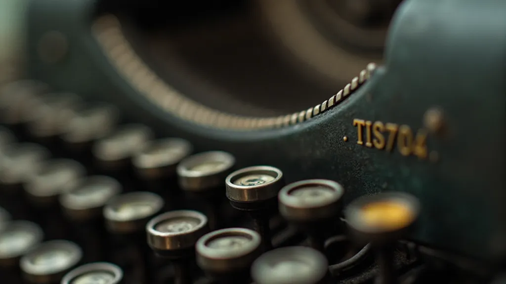
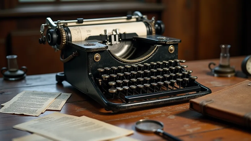
There's a certain melancholy that clings to antique typewriters. Not the sterile melancholy of obsolescence, but something richer, deeper – the echo of countless stories whispered, typed, and sent adrift. I remember my grandfather’s Underwood No. 5, a behemoth of polished steel and intricate mechanisms. The clatter of the keys wasn't just noise; it was a physical manifestation of thought, a rhythmic heartbeat to the stories he's told me. Now, as a digital creator, I find myself drawn to replicating that feeling – the essence of those machines – through the painstaking recreation of their distinctive fonts. It's more than just a visual aesthetic; it’s an attempt to capture the very soul of a bygone era, and to understand how those fonts subtly dictate the rhythm and feel of a narrative.
The shift from elegant cursive script to the mechanical precision of typewritten text represented a significant change in communication. Prior to the typewriter’s widespread adoption, correspondence was a deliberate act, a performance even. Letters were carefully composed, penned, and often adorned with flourishes and personal touches. The typewriter, suddenly, offered speed and standardization. It leveled the playing field; a shopkeeper could communicate with a businessman with an undeniable consistency, regardless of handwriting. But this efficiency came at a cost – a loss of intimacy, a shift towards a more impersonal style. Yet, within this perceived distance, a unique character emerged.
The Mechanics of Rhythm: From Hammer to Page
Consider the Remington No. 3, one of the earliest commercially successful typewriters. Its font, stark and utilitarian, reflected the era’s focus on functionality. A narrative set in this typeface feels grounded, pragmatic, even a little cold. It's a font that doesn’t invite flourishes; it demands directness. Then contrast this with the more ornate typeface of the Sholes & Glidden, a predecessor to the Remington. Notice the subtle curves, the slight variations in stroke width. A story using this font gains a touch of romanticism, a sense of introspection. It’s as if the inherent limitations of the machine – the imperfect replication of curves, the slight inconsistencies in letter spacing – contribute to a feeling of vulnerability, of genuine human expression. The beauty truly lies in appreciating these imperfections – a principle that many are now exploring in a symphony of imperfection, finding beauty in flawed digital reproductions.
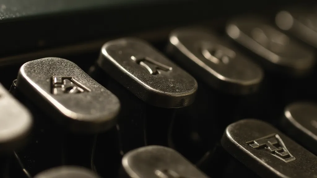
The typeface isn’t solely determined by the machine's design. The type slugs themselves—the metal blocks bearing the letterforms—were manufactured with varying degrees of precision. Imperfections are part of the charm. A slightly chipped ‘a’ or a misaligned ‘g’ aren’t flaws; they’re echoes of the craftsman's hand. They're tangible reminders that each piece of type was created with care, and that each document born from the machine is inherently unique. These subtle, often unnoticeable details are what provide the personality and character that separates one typewriter font from another; a depth that is best appreciated by those who truly study the typographer’s lens, deconstructing the aesthetic of historic typewriter models.
The Craft of Replication: More Than Just Pixels
Recreating these fonts digitally is a challenging endeavor. It’s not simply about tracing the shapes of the letters. It's about understanding the underlying mechanics that shaped them. I often spend hours studying original type slugs, meticulously measuring the angle of each stroke, the depth of the embossing, the subtle variations in letter spacing. It's a process that requires patience, a keen eye for detail, and a deep appreciation for the craft of the original typewriter designers and the metalworkers who brought their visions to life. The process is deeply intertwined with a nuanced understanding of how different typefaces evoke very specific emotional responses, an understanding that inspires a creative blend of styles – the alchemy of letters – to create unique effects.
The nuances are remarkable. The IBM Selectric, with its iconic "golf ball" printhead, produced a font that was virtually identical regardless of the typewriter’s condition. This inherent consistency lends itself to a certain modernity, a sense of precision and order. It’s a font that feels both functional and slightly detached, well suited for corporate memos and technical manuals. On the other hand, the Olivetti Lettera 22’s font, celebrated for its elegance, was often influenced by the wear and tear on the machine’s type slugs. A frequently used ‘e’ might be slightly more rounded than a less-used ‘z’, creating a subtle but noticeable individuality.
Tempo and Tone: The Font's Subconscious Influence
How do these fonts affect the reader's experience? A story presented in a stark, sans-serif typewriter font – like that of a Royal Standard – will likely feel more straightforward, economical in language, and perhaps even a touch pessimistic. Its lack of ornamentation doesn’t invite digression or embellishment. Conversely, a narrative set in a font from an Underwood Universal, with its distinctive, slightly asymmetrical letterforms, might evoke a sense of nostalgia, or a feeling of faded grandeur. The deliberate selection of a particular typeface is a significant choice in how a story is conveyed; it dictates the pace and tone in ways that words alone simply cannot.
Think about a historical fiction piece. Using a font from a machine commonly used during that period—for example, a Hammond X-12 for the 1950s—provides a layer of authenticity, subtly grounding the narrative in its time. It's a silent cue to the reader, a visual shorthand for the era’s aesthetic and technological landscape. Even the subtle imperfections – the tiny blemishes, the slight variations in spacing – can contribute to the overall mood. They serve as a constant, subconscious reminder of the human element involved in the writing process. They’re a subtle departure from the sterile perfection of digital fonts, a visual echo of the hands that once operated the machines.
It’s not merely about selecting a pleasing typeface; it’s about understanding how that typeface interacts with the story itself. It’s about using it to subtly guide the reader’s emotional response, to enhance the narrative’s pace and rhythm. It’s a powerful tool, one that demands respect and careful consideration. The careful curation of a typeface collection is also a significant endeavor for those seeking a precise emotional response – a process of the palette of the past – ensuring a visually evocative range of options.
Preserving a Legacy: Restoration and Collecting
The increasing interest in these fonts is spurring renewed appreciation for the machines themselves. Restoring antique typewriters is a labor of love, a painstaking process that requires mechanical expertise and a deep respect for the craftsmanship of a bygone era. It's about more than just fixing a broken machine; it’s about preserving a piece of history, ensuring that these remarkable artifacts continue to inspire future generations. The beauty of these machines, and their fonts, represents a carefully considered and nuanced aesthetic that is increasingly prized.
The mechanical intricacies and design choices behind these machines involved a degree of engineering prowess that is often overlooked in today's digital age. These machines aren't just tools; they are tangible artifacts of a specific time and place, each carrying a unique story of innovation and craftsmanship. Collectors often prioritize machines that retain their original type slugs, recognizing that even slight imperfections contribute to the machine's unique character. The act of collecting also allows for a deeper appreciation of the historical context surrounding these machines, allowing collectors to immerse themselves in the cultural landscape of the era.
The mechanical engineering involved in crafting these machines represents a remarkable feat of ingenuity, with intricate systems of levers, gears, and springs working in harmony to produce consistent and legible text. This appreciation for craftsmanship and mechanical detail extends beyond the machines themselves, fostering a deeper understanding of the historical context and cultural significance of these artifacts. Furthermore, the increasing interest in typewriter restoration and collection is contributing to a renewed appreciation for the skills and expertise of the craftsmen who built them, ensuring that their legacy continues to inspire future generations.
The resonance of the keys isn't just a nostalgic echo; it’s a living testament to the power of human ingenuity and creativity. By recreating these fonts, we're not just preserving a visual style; we're keeping alive a vital piece of our cultural heritage. We're ensuring that the stories whispered from those machines continue to resonate long after the last key has been struck. And with the growing appreciation for these machines, the future looks bright for preserving their legacy and continuing to inspire generations to come. The continued interest in preserving these machines ensures that the echoes of their keystrokes will continue to inspire awe and wonder for many years to come.