Beyond the Aesthetic: The Ergonomics of Typewriter Fonts and Writing Flow
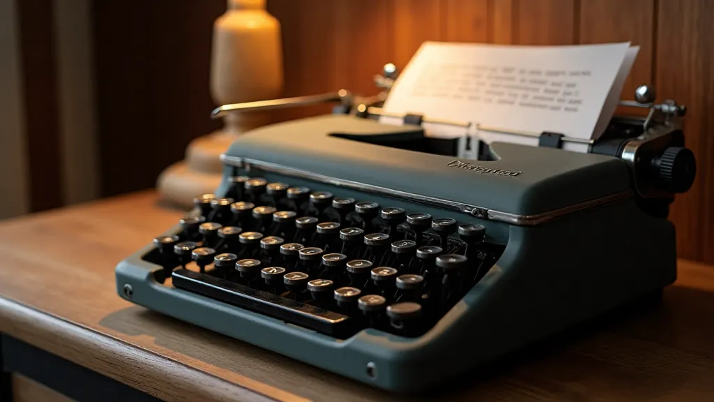
There's a peculiar magic that emanates from an antique typewriter. It's more than just the click-clack rhythm, or the satisfying *thunk* of the carriage return. It’s a feeling – a connection to a time when communication was a deliberate act, a physical creation. And so much of that feeling is inextricably linked to the typeface itself. We, as designers and typography enthusiasts, often admire these fonts for their visual appeal – their retro charm, their distinctive character. But beyond the aesthetic, lies a deeper, often overlooked aspect: the ergonomics of these fonts, and how their design profoundly impacts the writing process itself.
My own fascination began with a 1930s Underwood No. 2. I found it at a dusty antique shop, its keys frozen, its ribbon long gone. Restoring it was a labor of love, painstakingly cleaning each part, lubricating the mechanism, and eventually, replacing the ribbon. As I typed my first tentative words, the unique qualities of the Underwood's typeface – a robust, slightly condensed design – began to reveal themselves. It wasn't just about seeing the letters; it was about *feeling* them in the process of writing. This experience sparked a deeper exploration, leading me to the Replica Typewriter Font Library – a collection born from a similar desire: to accurately recreate these lost voices.
The Craftsmanship of Imperfection: More Than Just Letters
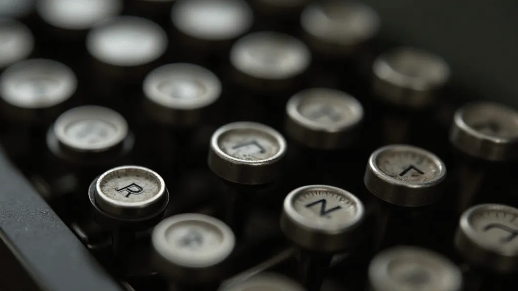
The beauty of a typewriter font isn’t found in perfect symmetry or flawless kerning. It's in the subtle imperfections, the tiny variations that arise from the mechanical process of letter creation. Early typewriters, especially, weren’t driven by sophisticated algorithms. Each letter was physically stamped onto a matrix, a process prone to slight inconsistencies. This isn't a flaw; it's a fingerprint of the era, a testament to the human hand involved in its creation.
Consider the Remington No. 2, a workhorse of the late 19th century. Its typeface, often referred to as “Standard,” is characterized by its relatively simple, slightly rounded forms. What often gets missed is the slight unevenness in the stroke weights, a consequence of the metal casting process. Replicating this accurately in a digital font requires a keen eye and a willingness to deviate from the rigid rules of perfect design. It's about capturing the *essence* of the original, not creating a sterile copy.
The Impact of Design on Writing Flow
The ergonomic impact of a typewriter font goes beyond mere visual appeal. It influences the rhythm of your writing, the ease with which you translate thoughts into words. Fonts with highly condensed forms, like those found on many early models, can feel slightly cramped, potentially leading to a sense of urgency or constraint. Conversely, more open, generously spaced fonts, such as those found on the later Royal Quiet De Luxe, can evoke a feeling of spaciousness and fluidity.
The spacing, too, plays a crucial role. Typewriter fonts, unlike many modern digital fonts, often have a relatively tight character spacing. This was dictated by the physical constraints of the type bars and the printing plate. While this might feel restrictive initially, it can also encourage a more deliberate and considered approach to writing. You’re less likely to simply dash off words; each character feels more significant, contributing to a richer, more textured prose.
Think about the experience of writing a novel on a manual typewriter. The physical act of striking each key, the sound of the bell announcing the end of a line – it all creates a unique feedback loop that influences the creative process. The typeface isn't merely a visual element; it's an integral part of that experience. It becomes a silent partner in the writing journey.
Beyond the Visual: Capturing the ‘Feel’
Creating accurate typewriter font reproductions isn't just about tracing the shapes of letters. It requires a deep understanding of the underlying mechanics of the typewriter and the printing process. We're not just replicating the visual appearance; we're attempting to capture the “feel” of the original. This involves analyzing the spacing, the stroke weights, the subtle distortions that arise from the mechanical process.
For instance, the Olivetti Lettera 22, a design icon of the mid-20th century, has a typeface renowned for its elegance and legibility. Replicating this font requires more than just copying the letterforms; it necessitates understanding how the type bars were shaped, how the inking process affected the appearance of the characters. It’s about recreating the entire ecosystem of the typewriter, not just the typeface itself.
Collecting and Restoring: A Connection to the Past
The fascination with antique typewriters and their fonts often extends beyond mere appreciation to a genuine desire for preservation. Collecting these machines and restoring them to their former glory is a way of connecting with the past, of safeguarding a vital piece of cultural heritage.
When restoring a typewriter, paying close attention to the typeface is paramount. Often, the font is worn or damaged, making accurate reproduction challenging. Examining examples of typed documents from that era can provide valuable insights into the original appearance of the font.
The Future of Typewriter Fonts
In a world dominated by sleek digital interfaces and customizable fonts, the enduring appeal of typewriter fonts speaks to a deeper longing for authenticity and connection. These fonts offer a unique window into the past, a reminder of a time when communication was a more deliberate and tactile experience.
The Replica Typewriter Font Library aims to preserve and celebrate this legacy, providing designers and typography enthusiasts with accurate reproductions of these iconic typefaces. It’s not just about recreating fonts; it’s about preserving a piece of history, one keystroke at a time.
The subtle nuances, the imperfections – these aren’t flaws; they’re the hallmarks of a bygone era. And they are, ultimately, what makes these fonts so incredibly captivating.