Unveiling the Subconscious: Typewriter Fonts and Emotional Subtext
The click-clack of a typewriter. It’s a sound steeped in history, a rhythmic pulse that once dictated the cadence of communication. Beyond the mechanics, beyond the tangible keys and inked ribbon, lies something more intangible – an emotional resonance that lingers even in the digital realm. We’ve poured countless hours into recreating these fonts, not just as meticulous reproductions, but as vessels carrying the echoes of the past. This isn't simply about replicating a typeface; it’s about understanding the subconscious power embedded within it.
My grandfather, a taciturn man of few words, kept an Underwood No. 5 in his study. It wasn't a showpiece, but a tool – a trusted companion in crafting letters and reports. I remember the smell of the ink, the slight tremor in his hand as he typed, the focused intensity in his eyes. That machine wasn't just a typewriter; it was a portal to a quieter, more deliberate era. That's the feeling we strive to capture with our digital typewriter font library – a sense of quiet contemplation, a connection to a time when words carried more weight.
The Mechanical Soul: Craftsmanship and Character
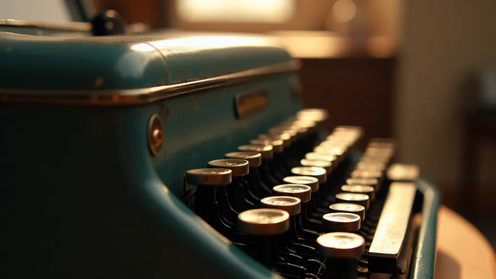
The beauty of antique typewriters isn't just aesthetic; it’s inherent in their construction. Each machine was painstakingly assembled, often by skilled artisans who took pride in their craft. The typeface itself, impressed onto the metal matrix, was a marvel of engineering – a tiny, precise representation of the font's design. This inherent craftsmanship instilled a certain gravitas to the text produced. Today’s digital reproductions attempt to echo that – to convey the solidity and permanence of metal type striking paper.
Consider the Remington Standard. Introduced in 1873, it’s characterized by a certain blunt honesty. The typeface, robust and somewhat utilitarian, speaks of practicality and efficiency – the hallmarks of the burgeoning industrial age. Conversely, the Olympia SM9, a machine popular in the mid-20th century, possesses a more refined and elegant feel. Its typeface, cleaner and more streamlined, reflects the post-war era's embrace of modernism. We’re not just replicating fonts; we’re attempting to capture the spirit of the machine and the era it represents.
Emotional Typography: Beyond Aesthetics
Typography, at its core, is about communication. But it's also about more than just readability. Certain fonts evoke specific emotions, even subconsciously. The fonts from a Royal Quiet De Luxe, for example, possess a certain air of sophistication and tranquility. They suggest a more contemplative, refined writing style. Using such a font for a personal letter might subtly convey a sense of respect and thoughtful consideration.
Think about the difference between using a crisp, modern sans-serif font versus one derived from an Underwood Standard. The former might convey efficiency and innovation, while the latter could evoke a sense of nostalgia, historical weight, and perhaps even a touch of melancholy. This distinction speaks to the broader influence of type on perception. The nuances in stroke weight, letter spacing, and overall feel can dramatically alter the impact of the written word, impacting how effortlessly a reader connects with the content, and even influencing their interpretation of the message itself. Understanding this impact, and leveraging it strategically, is crucial for effective design.
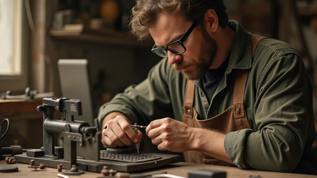
Restoration and Reverence: Preserving the Legacy
The process of recreating these fonts isn’t simply a matter of scanning typefaces. It requires painstaking analysis – examining the subtle imperfections, the slight variations in stroke weight, the minute details that give each font its unique character. It’s akin to restoring an antique – understanding its history, appreciating its flaws, and preserving its essence.
Many of these machines were workhorses, subjected to years of heavy use. The typefaces themselves bear the marks of that history - tiny chips, subtle wear patterns that contribute to their unique charm. We strive to incorporate those imperfections into our digital reproductions, acknowledging the machine’s journey and adding authenticity to the digital typeface. Recognizing and appreciating these marks isn't just about aesthetics; it's about honoring the machine’s story and the hands that guided it. Those who delve into the world of antique typewriters often find that ink-stained memory isn't just a poetic phrase—it's a testament to the enduring link between type and time.
The Psychology of Type: Shaping Perception
The choice of font can subtly influence how readers perceive the content. A bold, assertive typeface might be suitable for a business proposal, while a more delicate, handwritten-style font might be perfect for a romantic poem. The typewriter fonts in our library provide a spectrum of options, each with its own distinct personality.
Consider a legal document. Using a typewriter font, particularly one derived from a sturdy, reliable model like an IBM Selectric, can imbue it with a sense of authority and permanence. Conversely, using a more playful or whimsical typewriter font for a marketing campaign could convey a sense of creativity and innovation. Beyond the choice itself, understanding *why* certain typefaces evoke specific responses is an increasingly important consideration for designers seeking to connect with their audience on a deeper level – a topic often explored when considering beyond novelty in the realm of typography.
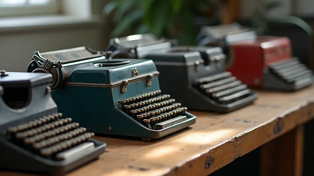
Collecting and Appreciation: A Journey Through Time
Collecting antique typewriters is more than just accumulating objects; it’s about connecting with history, appreciating craftsmanship, and understanding the evolution of communication. Each machine tells a story – a narrative of the era in which it was created, the people who used it, and the words it helped to shape.
Restoring a typewriter can be a deeply rewarding experience. It requires patience, skill, and a genuine appreciation for the machine's intricate mechanics. The feeling of bringing a piece of history back to life is truly unparalleled. Our font reproductions offer a similar opportunity – to experience the aesthetic and emotional qualities of these machines without the challenges of physical restoration.
Beyond the Click-Clack: The Enduring Legacy
The typewriter, once a ubiquitous presence in homes and offices, has largely been supplanted by digital technology. Yet, its legacy endures – not only in the fonts that bear its name, but also in the nostalgic appeal it holds for those who appreciate the craftsmanship and character of a bygone era. Our digital typewriter font collection is an attempt to keep that legacy alive, providing designers and typography enthusiasts with the tools to evoke the emotions and atmosphere of a simpler, more deliberate time. It’s a testament to the power of typography to transcend mere aesthetics and connect us to the past, to the human stories embedded within the click-clack of the keys.
The deliberate nature of typewriter use, the need to carefully consider each word before it struck the page, fostered a different kind of writing – one characterized by precision and intentionality. This deliberate pace and the tangible connection to the written word are increasingly valued in a world dominated by ephemeral digital communication. The challenge for designers today is to capture this essence, to translate the feeling of permanence and weight into modern design.
Furthermore, exploring the ergonomics and writing flow enabled by various typewriter models demonstrates a deeper understanding of the human element in the writing process. Studying how different keystroke mechanisms and font designs influenced the writer's experience can offer valuable insights for modern designers seeking to improve writing comfort and creativity. For those interested in the often-overlooked details impacting a writer’s experience, further investigation may lead to exploring beyond the aesthetic in the world of typewriters and fonts.