The Unspoken Dialogue: How Typewriter Fonts Enhance Subtextual Meaning
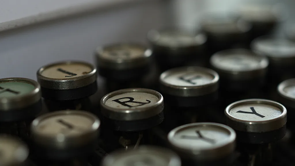
There's a peculiar intimacy that arises when you examine an antique typewriter. It's not simply a machine; it's a silent witness to countless thoughts, anxieties, declarations of love, and desperate pleas. Each imperfection – the slight misalignment of characters, the faint ink bleed, the occasional hesitant strike – whispers a story of the hand that guided it, the mind that conceived the words. And replicating that essence, that feeling, in a digital font is an act of profound respect, a quest to resurrect a lost voice.
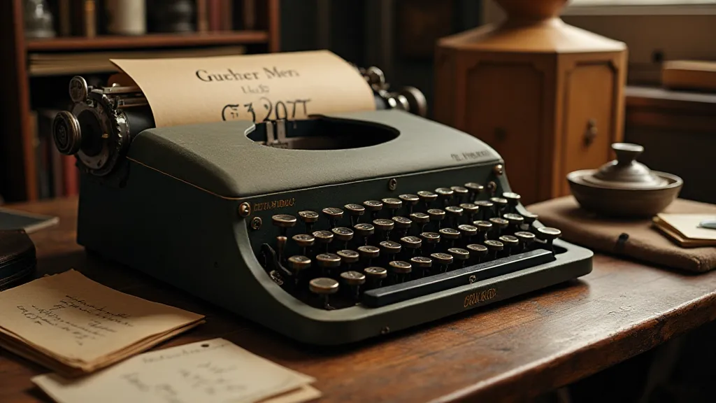
Our Replica Typewriter Font Library isn't just about providing fonts; it's about preserving a legacy. It began with a single, battered Royal Quiet De Luxe – a gift from my grandfather, a journalist who’s now sadly passed. I spent hours cleaning and studying it, mesmerized by its mechanical elegance and the peculiar vulnerability of the typeface. It wasn't just about typing; it was a performance, a considered act of creation. It became clear that the typeface itself wasn't just a visual element; it held a layer of meaning, an unspoken dialogue between the writer and the reader.
Beyond Aesthetics: The Psychology of Typewriter Typography
Modern typography often prioritizes legibility and neutrality. While those qualities are valuable, they can also strip away the personality of a text. A Helvetica or Arial might convey clarity, but a typeface meticulously recreated from a 1930s Underwood No. 5 carries a different weight entirely. It evokes an era of hardship and resilience, of wartime correspondence and burgeoning artistic expression. It subtly informs the reader, without the need for explicit pronouncements. The nuances of these fonts extend far beyond mere aesthetics; understanding how they impact writing flow and overall design is crucial to truly appreciating their value.
Think about a love letter typed on a Smith Corona Silent. The very name – “Silent” – suggests discretion, a confiding intimacy. Doesn't that typeface inherently convey a sense of secrecy and quiet longing, even before a single word is read? Or consider the stark, almost brutal simplicity of a Hammond X-Writer, frequently used for legal documents and business correspondence. Its font screams authority and precision, a visual cue that subtly shapes the reader's perception of the text’s importance and legitimacy. The choice of font, in such scenarios, can fundamentally alter the perceived tone and seriousness of a message.
The Craft of Reproduction: More Than Just Pixel-Perfect Accuracy
Recreating these typewriter fonts isn't simply a matter of digitally tracing the shapes of the letters. It’s an act of observation, a painstaking attempt to capture the character of the original typeface. We analyze the letter spacing, the slant of the strokes, the slight variations in weight caused by the mechanics of the machine. The imperfections are just as crucial as the perfect forms. A pristine, digitally manufactured font loses the human touch, the subtle irregularities that give typewriter text its unique charm. Understanding how these choices affect the overall feeling is a key part of our process; it’s about more than just replicating the appearance, but also the experience of the original.
The process often involves microscopic examination of original type bars, photographs of printed pages, and even simulations of the mechanical processes that produced the letters. We spend countless hours studying the nuances of each model – the way the ink bleeds on the page, the subtle distortions caused by the pressure of the type bar, the tiny flecks of metal that cling to the letterforms. It’s a blend of technical skill and artistic intuition, a deep dive into the mechanics of a bygone era. We strive to create fonts that genuinely resonate with the spirit of their predecessors, capturing not just the visual details but also the feeling of creating with those machines.
Specific Models and Their Subtextual Implications
Let's briefly consider a few models and how their replicated fonts can subtly enhance meaning. The IBM Selectric, with its distinctive "golf ball" type element, was ubiquitous in the 1970s and 80s. Its typeface, though technologically advanced for its time, carries a sense of corporate efficiency and a certain sterile formality. Using it in a modern context could ironically underscore a lack of genuine feeling or a deliberate attempt to appear impersonal. The choice to use such a font speaks volumes about the intended message and the desired impact on the audience.
Conversely, the Olivetti Lettera 22, popular among artists and intellectuals, conveys a sense of creative expression and thoughtful contemplation. Its typeface, elegant and understated, lends itself well to poetry, essays, and personal reflections. The Corona Standard, widely used for news and correspondence in the mid-20th century, can impart a sense of nostalgia, urgency, or even journalistic objectivity, depending on the context. The thoughtful selection of fonts, as we’re demonstrating, is a crucial element in conveying a specific tone and atmosphere. We believe these nuances are often lost in modern typography, and our goal is to restore them. Matching fonts to their historical contexts allows us to appreciate the true power of typography as a storytelling tool.
The Restoration Connection: Appreciating the Originals
Our work isn’t just about digital fonts; it’s also driven by a deep appreciation for the original machines. We frequently receive inquiries from typewriter collectors seeking advice on restoration and maintenance. There’s a profound satisfaction in seeing a neglected typewriter brought back to life, its mechanical beauty restored, its voice rediscovered. It's a fascinating journey into the history of these machines and the people who used them. The act of restoring a typewriter provides an invaluable insight into the design and construction of these remarkable devices.
Restoring a typewriter is an act of preserving history, a tangible connection to the hands that guided it and the words it produced. It’s a process that demands patience, precision, and a genuine love for the craftsmanship of a bygone era. And, of course, understanding the nuances of each model’s typeface becomes invaluable – recognizing wear patterns, identifying unique characteristics, and ensuring the correct ribbon type is used for optimal print quality. This deep understanding influences how we recreate the fonts; every detail is considered.
Beyond the Page: Integrating Typewriter Fonts in Modern Design
The beauty of typewriter fonts lies in their versatility. They can be used to create a wide range of moods and styles, from vintage advertising campaigns to personal websites and handcrafted invitations. Their inherent character allows them to stand out from the sea of generic, sans-serif fonts that dominate the digital landscape. The careful and considered application of these fonts can transform any design project, imbuing it with a sense of authenticity and timeless appeal.
However, it's important to use them thoughtfully. A little goes a long way. Overuse can feel contrived, diminishing the impact of their inherent charm. Integrating them strategically – using them for headlines, captions, or short blocks of text – can add a touch of authenticity and personality to any design. The right touch of nostalgic typography can significantly enhance a project’s visual identity and emotional resonance. Consider, for instance, the power of choosing a typeface that truly reflects the story you’re trying to tell; it’s a subtle but incredibly effective technique.
Preserving the Echoes of the Past
Our Replica Typewriter Font Library is more than just a collection of fonts; it's a tribute to the ingenuity of the past, a celebration of the human connection to the written word. It's an attempt to preserve the echoes of countless stories, to resurrect the voices of those who typed them, and to share that experience with a new generation. We believe that these fonts offer a unique opportunity to add depth, personality, and authenticity to any written work – a chance to whisper a story from the past into the present. We’re actively working to catalog and recreate more fonts from significant eras, further expanding our collection and contributing to the preservation of typographic history. It's a pursuit of authenticity and a commitment to reviving the unique character of bygone eras. As we continue our work, we invite you to explore the broader topic of preserving typographic history, a fascinating area that influences our own font reproduction process. You can learn more about how we match fonts to their historical contexts here.